I just spent some time playing arround with a PS template called Shoply. It is a Warehouse derivate. This has a nice way to inflate html text block on homepage when viewed on mobil phone. I wanted to use your HTML Box Pro and thought it had the option to. Or at least to disable block/hook totally if viewed via mobile phone or for certain resolutions :) In a nutshell I want to use you module to ad text block with lots of SEO text on my homepage. But this does not look so hand if you browse via mobile...
Hide some contents in responsive mode
Hello
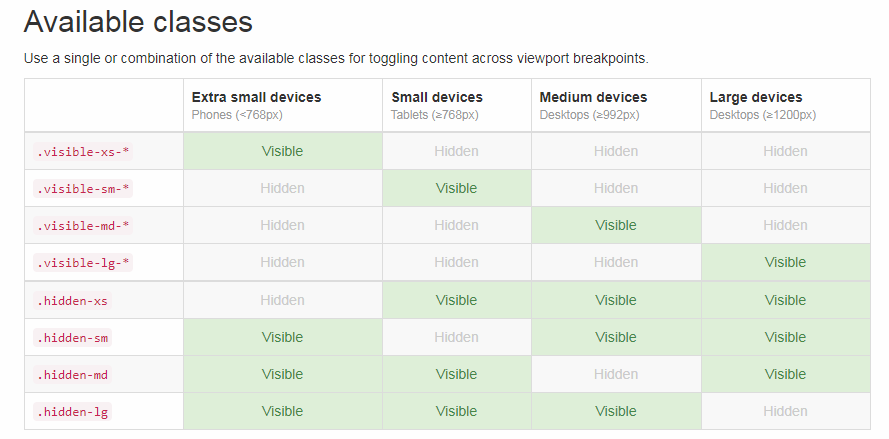
contents that you want to hide on mobile you can put into the div
- hidden-xs (hidden on extra small devices < 768px)
- hidden-sm (hidden on small devices > 768px)
- hidden-md (hidden on medium devices > 992px)
- hidden-lg (hidden on large devices >1200px)
contents that you want to hide on mobile you can put into the div
<div class="hidden-sm">
your contents to hide on mobile device
</div>
available classes:
- hidden-xs (hidden on extra small devices < 768px)
- hidden-sm (hidden on small devices > 768px)
- hidden-md (hidden on medium devices > 992px)
- hidden-lg (hidden on large devices >1200px)
hi, Vekia,
ReplyDeletei would like to hide a link on medium and large devices.
i try many options like your propose.
and the last is "span class="hidden-md hidden-lg" Hidden on Large and medium span"